Monday 19 May 2014

Personal Branding//Promo Pack

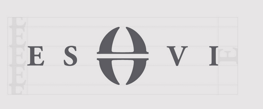
My branding is very simple and straight to the point as I didn't want too overpowering. However, I think this design reflects me and my practice as even though it is clean, it also has a personal touch with the hand rendered initials. I feel like the logo really stands out and the bright pink background brings out the white stock. I have included a cover letter, CV and business card in my pack. 


Sunday 18 May 2014

Personal Branding//Final Cover Letter


My cover letter is what I would right to studios I would want to do a placement at. 


Personal Branding//Final CV

Here is my final cover letter, it is very simple to keep along side the rest of my branding. My CV has my education, personal statement, experience and skills set. I have laid it out with quite a lot of space so the person reading it can see each section clearly. 


Thursday 15 May 2014

Contacting Studios

Hearing from John that there may be an internship opportunity at Hatched in London, I decided to email them and send them my portfolio. They said that I would hear back from them by the end of the Month as that is when they are organising interviews. 


Tuesday 13 May 2014

Studio Research//Hatched

Hatched is a brand communication company in London that I heard about through John. I had never heard them before but after visiting their website I realised that they do work that I really aspire to. Being a branding agency, they obviously do a lot of branding, but I like how they do such a variation. Some of their work is quite feminine but then other projects are more corporate. 


About what they do


Work Example 1 

This project was to brand a Jewellery company. The did all the branding and the web design. I feel like this something I like to do in my practice, design both the print and digital aspects. This design is very well executed, communicating a stylish and clean finish. 


Work Example 2

I really like this website design for Marco Grill restaurant. Recently I have got into food packaging and photography. I think the way they have used the black and white imagery behind the bold white text is very effective and impacting. 


Sunday 20 April 2014

Saturday 19 April 2014

Ken Garland// First Things First Manifesto

Ken Garland is a very inspiration figure, he is very well know for his 'First things first manifesto'. He 


Ken Garland is a British graphic designer, photographer, writer and educator. He has made a significant contribution to the development of graphic design since the mid-twentieth century and formed the prolific design studio Ken Garland & Associates in 1962 (until 2009) in Camden, London, where he continues to live and work.


The First Things First manifesto was written 29 November 1963 and published in 1964 by Ken Garland. It was backed by over 400 graphic designers and artists and also received the backing of Tony Benn, radical left-wing MP and activist, who published it in its entirety in the Guardian newspaper.
Reacting against a rich and affluent Britain of the 1960s, it tried to re-radicalise a design industry which the signatories felt had become lazy and uncritical. Drawing on ideas shared by Critical Theory, the Frankfurt School and the counter-culture of the time it explicitly re-affirmed the belief that Design is not a neutral, value-free process.
It rallied against the consumerist culture that was purely concerned with buying and selling things and tried to highlight a Humanist dimension to graphic design theory. It was later updated and republished with a new group of signatories as the First Things First 2000 manifesto.


Friday 18 April 2014

Design Cheltenham

cheltenham had a design festival in April and as I live in Gloucestershire I thought I would go to a talk. I went to see the ken Garland and Kenneth and Sir Kenneth Grange. The talks were very interesting, they gave me an insight into how design has evolved and how Art schools and education have such an influence on today design. 


Wednesday 2 April 2014

Nottingham Trent Collaboration


After launching my website, I was approached by a third year fashion concepts student from Nottingham Trent University to collaborate on a live L'oreal brief. The project was to create a new product for the mens range 'Kiehls'. Having a strong interest in brand identity and packaging I was really keen to collaborate.

Unfortunately as the communication was quite slow and the deadline so close I was unable to do this brief. 


Saturday 29 March 2014

Contacting Studios

At first, contacting studio was something that I found taunting, but once had emailed a few studios I felt more confident and it didn't seem so intimidating. I found that just starting a conversation with a studio and asking questions started more of a dialogue. 


Friday 28 March 2014

Studio Research//Here Design

I have also had an instant like for this studios work and was lucky enough to pay them a visit in London Fields. It is a very small studio considering the amount of work and recognised clients they get. 


Here design do more high end packaging for brands like Fortnum and Mason, The Balvenie and Hendricks gin. 


This honey packaging is for Fortnum and Mason so it needs to sophisticated and luxurious. The intricate and decorative design gives the high end aesthetics and the using the product as the colour is eye-catching on a shelf. 


Honey Packaging


Gelupo Gelato Brand Identity


Studio Visits//Elmwood

After doing the 'brand the boring' brief set by Elmwood in Leeds, I really liked the way they advised us on approaching the brief. I had heard of them before but I decided to look at their work in more detail. I like how they are a big company as I see myself a team player and enjoy collaborating with lots of designers. 


This is a brief they did for Anchor Butter. I like how they do projects for really commercial brands rather than small independent ones. 


Having a passion for packaging, I really like the light hearted approach they have to design. The bottle labels Elmwood did for Anchor squirty cream is clever yet you can tell they have the appropriate target audience in mind.  


They way the make on the shelf items look high end is something that I think is making their design better than other agencies and studios. This fish packaging is really simple yet very stylish. When you are designing a product, you want it to appeal to as many people as possible. The public want to feel as though they are getting more for their money and I think packaging like this definitely does this. 


I also went to their branch in London and gave them a promo pack. I didn't hear from them for a while but I recently received an email starting a dialogue. 


Thursday 27 March 2014

Studio Visits//Heavenly Branding

Heavenly Branding agency is situated in Euston, London and another place I stopped by. Unfortunately I was only able to drop of my promo pack but since visiting I have been speaking to a designer there. 


Amongst the branding they do quite a lot of campaign work with strong concepts, even though this is not something that I have a lot of within my portfolio, this is an area I want to improve on and get more involved in. 

This brand identity and campaign is raise awareness of mens mental health has a contemporary design and grabs my attention straight away. The use of impacting colours against the hand rendered type gives a personal aesthetic which is appropriate to the concept.