Saturday 29 March 2014
Contacting Studios
At first, contacting studio was something that I found taunting, but once had emailed a few studios I felt more confident and it didn't seem so intimidating. I found that just starting a conversation with a studio and asking questions started more of a dialogue.
Friday 28 March 2014
Studio Research//Here Design
I have also had an instant like for this studios work and was lucky enough to pay them a visit in London Fields. It is a very small studio considering the amount of work and recognised clients they get.
Here design do more high end packaging for brands like Fortnum and Mason, The Balvenie and Hendricks gin.
This honey packaging is for Fortnum and Mason so it needs to sophisticated and luxurious. The intricate and decorative design gives the high end aesthetics and the using the product as the colour is eye-catching on a shelf.
Honey Packaging
Gelupo Gelato Brand Identity
Studio Visits//Elmwood
After doing the 'brand the boring' brief set by Elmwood in Leeds, I really liked the way they advised us on approaching the brief. I had heard of them before but I decided to look at their work in more detail. I like how they are a big company as I see myself a team player and enjoy collaborating with lots of designers.
This is a brief they did for Anchor Butter. I like how they do projects for really commercial brands rather than small independent ones.
I also went to their branch in London and gave them a promo pack. I didn't hear from them for a while but I recently received an email starting a dialogue.
This is a brief they did for Anchor Butter. I like how they do projects for really commercial brands rather than small independent ones.
Having a passion for packaging, I really like the light hearted approach they have to design. The bottle labels Elmwood did for Anchor squirty cream is clever yet you can tell they have the appropriate target audience in mind.
They way the make on the shelf items look high end is something that I think is making their design better than other agencies and studios. This fish packaging is really simple yet very stylish. When you are designing a product, you want it to appeal to as many people as possible. The public want to feel as though they are getting more for their money and I think packaging like this definitely does this.
I also went to their branch in London and gave them a promo pack. I didn't hear from them for a while but I recently received an email starting a dialogue.
Thursday 27 March 2014
Studio Visits//Heavenly Branding
Heavenly Branding agency is situated in Euston, London and another place I stopped by. Unfortunately I was only able to drop of my promo pack but since visiting I have been speaking to a designer there.
Amongst the branding they do quite a lot of campaign work with strong concepts, even though this is not something that I have a lot of within my portfolio, this is an area I want to improve on and get more involved in.
This brand identity and campaign is raise awareness of mens mental health has a contemporary design and grabs my attention straight away. The use of impacting colours against the hand rendered type gives a personal aesthetic which is appropriate to the concept.
Wednesday 26 March 2014
Studio Research//Studio Twig
Studio Twig is a small studio in Chiswick that I went to visit. They specialise in high end packaging, brand identity and web design.
I really like their concepts and how they execute them into a brand. The 'Loquet' brief shows how they can make a product look very high end in such a simple way.
I really like their concepts and how they execute them into a brand. The 'Loquet' brief shows how they can make a product look very high end in such a simple way.
I like the way they incorporate colour into 'To A Tea', it is bright but not over used. What I like about studio twig is the type of briefs they take on. They are not too corporate and more commercial.
Tuesday 25 March 2014
Studio Visits
Jenna and I contacted some studios that produce work we like and we were able to go to London and visit some of them. Personally I want to work in a studio that focusses on brand identity and packaging. Here is a list of studios that we contacted and went to see. With me I took promo packs to give out.
Monday 24 March 2014
Personal Branding//Final Website
Here is my final website: www.emilyjamesdesigns.co.uk
I think the consistency through the pages make it easy to see the work and the grid system gives it structure. Even though the layout it very simple, I think this is best as it is straight to the point. Also the side navigation allows for the projects to be added in and removed without ruining the layout.
Wednesday 19 March 2014
Photography Collaboration
This year our course was encouraged to collaborate with someone on photography. I am not the best photographer and want my work to be well photographed for my portfolio so I thought I would take the opportunity to collaborate. Rather than going with a photographer who does work that I particularly want to brand, I decided more on their work ethic. Ben Harris and I decided to collaborate because we are both quite organised and motivated in our practices. I knew I could rely on Ben to do a good job when photographing my work. Ben is a sports photographer as well as doing other commercial shoots. I wanted to do his branding as a lot of work in my portfolio is targeted at girls, and I want to be able to show that I can also produce more masculine and corporate work.
Friday 7 March 2014
Personal Branding//Promotional Research
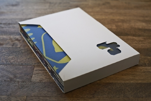
I did quite a range of research to inform my personal branding. I want to keep it simple and found that using initials makes the aesthetic minimal and professional. I like the different ways I could potentially pack my promotional material. I think something different from just an ordinary envelope is more likely to catch a studios or clients attention.
Monday 3 March 2014
Manifesto Presentation
Here is my manifesto presentation. I tried to base it on my real life influence as well as design.
Subscribe to:
Posts (Atom)


