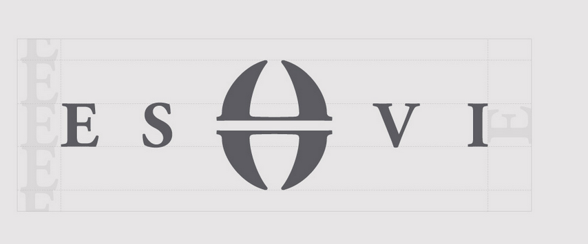
My branding is very simple and straight to the point as I didn't want too overpowering. However, I think this design reflects me and my practice as even though it is clean, it also has a personal touch with the hand rendered initials. I feel like the logo really stands out and the bright pink background brings out the white stock. I have included a cover letter, CV and business card in my pack.
Monday, 19 May 2014
Sunday, 18 May 2014
Personal Branding//Final CV
Here is my final cover letter, it is very simple to keep along side the rest of my branding. My CV has my education, personal statement, experience and skills set. I have laid it out with quite a lot of space so the person reading it can see each section clearly.
Thursday, 15 May 2014
Contacting Studios
Hearing from John that there may be an internship opportunity at Hatched in London, I decided to email them and send them my portfolio. They said that I would hear back from them by the end of the Month as that is when they are organising interviews.
Tuesday, 13 May 2014
Studio Research//Hatched
Hatched is a brand communication company in London that I heard about through John. I had never heard them before but after visiting their website I realised that they do work that I really aspire to. Being a branding agency, they obviously do a lot of branding, but I like how they do such a variation. Some of their work is quite feminine but then other projects are more corporate.
About what they do
Work Example 1
This project was to brand a Jewellery company. The did all the branding and the web design. I feel like this something I like to do in my practice, design both the print and digital aspects. This design is very well executed, communicating a stylish and clean finish.
Work Example 2
I really like this website design for Marco Grill restaurant. Recently I have got into food packaging and photography. I think the way they have used the black and white imagery behind the bold white text is very effective and impacting.
Subscribe to:
Comments (Atom)


