
Recently we had Si Scott visit the university and did a presentation to the first, send and third year graphic courses. I was very excited about this talk as it is an area of design that I am personally inspired by. I thought I would do some research into him and his work.


Si Scott has worked for some very big companies, with all very different briefs.


http://www.siscottstudio.com/
Work
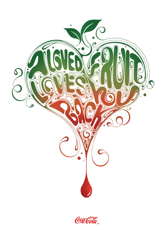
The main thing that draws me Si Scott's work is the precise hand rendered type. It is so detailed and communicates clearly. I also find it amazing how he appeals to such a wide target audience. For example he has done work for Adidas and the Olympics both sporting events and then jumps to book covers and branding for high end jewellery brand, Tiffany.


www.swiss-miss.com
Here is an interview that I came across.
Who is Si Scott? Tell us a little about yourself?I am a graphic designer from the Uk who is originally from Leeds but has moved around the country quite a bit (the next plan is to spend some time living abroad hopefully New York or somewhere like that). I left school at 16 and went to Leeds College Of Art & Design (Where I am now a part time lecturer) to study a BTEC in Graphic Design and then a foundation in Visual Communication, before going to Buckinghamshire Chilterns University to study a degree in Graphic Design. Upon completion I stayed in London for another 2 or 3 years and worked for a number of different small designa gencies whilst continuing with my own work and freeelance projetcs on the side.
You’ve been making some really innovative type work. Describes us your process and how you’ve come to make this kind of work.I always start by picking a font I feel fits the brief or works with what I am trying to achieve the piece and then will play around with different page layouts for a while. The next pahse is to just bring the piece to life using fineliners to create the illustration. I always work bigger than the finsihed piece is going to be and scan the illustrations at 1000dpi at 125% so when it is decreased to the actual size it’s very crsip an clean.
You’ve been making some really innovative type work. Describes us your process and how you’ve come to make this kind of work.I always start by picking a font I feel fits the brief or works with what I am trying to achieve the piece and then will play around with different page layouts for a while. The next pahse is to just bring the piece to life using fineliners to create the illustration. I always work bigger than the finsihed piece is going to be and scan the illustrations at 1000dpi at 125% so when it is decreased to the actual size it’s very crsip an clean.
I think I came to make this kind of work just through my love of drawing, type and design and trying to do something that encompasses all them together.
Where do you get your inspiration?
Most of my inspiration comes ffrom music – I am constantly listening to music while I work and the lyrics especially. I’m really into words!
You have just created “We are bitch” with Kerry Roper. How come you got to work with him, andwhen have you decided to create this already promising studio?
I’ve known Kerry quite a few years now from my days of living in London. We just became mates and always said we’d do something together. So we decided to set up a studio together – we are both really busy with our own stuff at the minute which means unfortunately we haven’t had time to really concentrate on ‘We Are Bitch’ – hopefully we’ll get a chance to work together a bit more in the future.
And to conclude, name three of your favorite fonts.
Helvetica (family)
Akzidenze Grotesk (family)
Pagan Poetry
and too many more to mention.
Akzidenze Grotesk (family)
Pagan Poetry
and too many more to mention.
http://www.typeforyou.org/2006/08/30/si-scott-interview/
No comments:
Post a Comment