HTML
Not being that confident in coding my own website, I thought it is time to take on the challenge to help get my work out there and improve my knowledge on HTML. The website layout is going to be quite simple so it is my work that gets the message across.
First of all, the navigation was created which is where the projects will be linked.
This is what it would look like now without creating the CSS style sheet. But first of all, the components of the website need to be put into the
To see if the everything is linking, the next part of code applied is the images. This is entered under the 'content' div.
Next step is to start creating the CSS style sheet so that the layout and aesthetics is correct.
To make it easier to see where everything is, the background colour for different components is different.
My logo has replaced where the 'header' is. It is quite small but keeps the page simple.
Padding is applied to the navigation so that the type is not too close to the logo.
The image size was changed to see how it would fi the page. The final size has yet to be decided.
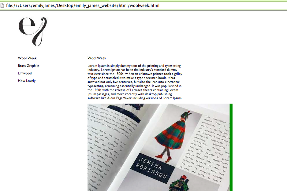
Here is what the website is looking like so far when the coloured areas are taken away. The logo in the top left corner leads to the navigation bar down the right hand side. The project featured is on the right, where the images will scroll downwards.


No comments:
Post a Comment